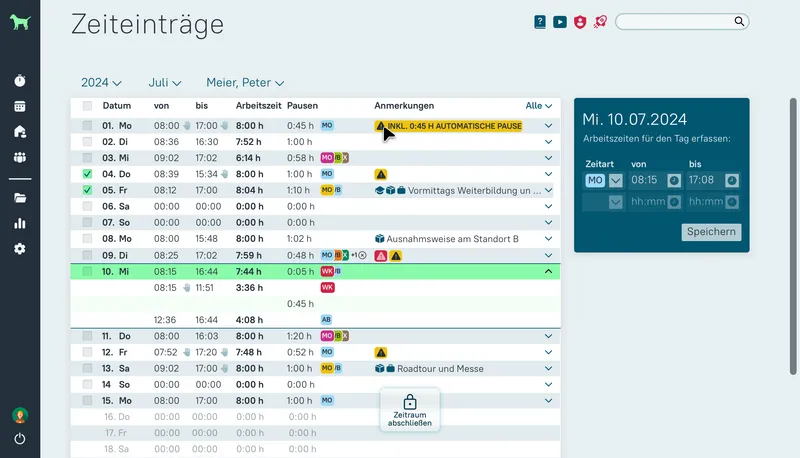
askDANTE systems: Brand and Product reimagined
Complete brand relaunch, UI redesign of a B2B SaaS application, new mobile app, and consistent trade show presence — delivering measurably stronger brand perception without disrupting ongoing development.
Overview
askDANTE systems is a Kiel-based software company developing a B2B SaaS application for professional time tracking, tailored specifically to the German market and its legal requirements. As sole designer, I took on an unusually broad brief spanning brand identity, web application redesign, mobile app design, and trade show materials over three years.
Problem
The product UI had grown organically over years without systematic attention to accessibility or modern usage patterns. A radical overhaul was not viable given significant backend technical debt. Simultaneously, the brand lacked emotional differentiation — present at trade shows, but interchangeable. The core challenge: how far can a redesign go to feel meaningfully better without slowing development?
Constraints
- Significant backend technical debt limited the scope of frontend changes.
- No budget or timeline for a full rewrite — improvements had to work within existing architecture.
- Brand needed to bridge a technically dry product with emotional accessibility.
- Sole designer responsible for all workstreams simultaneously.
Approach
I began with a technical audit alongside the development team — not to accept constraints, but to understand them. This produced a shared picture of which UI components could be modernised with reasonable effort and which had to wait. In parallel, I initiated a moderated round table with selected existing users — not to collect wish lists, but to identify concrete friction points in daily workflows. These insights directly shaped which areas of the application were prioritised and gave me internal leverage to argue for design decisions that might otherwise have been dismissed as nice-to-have. The brand concept was developed around two poles: the technically precise product on one side, emotional warmth and approachability on the other.
Project deliverables
App redesign
Visual overhaul of the existing SaaS product.
- New design system with modernised UI components
- Icons and illustrations
- Implementation of a handoff process and Zeplin
- Initiate user round table to ground design priorities in real usage and real user perspectives
Branding
Aligning the brand assets to the new product strategy.
- Redesign logo
- Brochures, flyers, post cards
Mobile app
A mobile compagnon for clocking in/out and checking personal time balance.
- Responsive adaptation and new interaction model
- Design assets for iOS and Android
Trade fair stand
Conceptual design of multiple exhibition stands for various events.
- Design and stand architecture
- Coordination and collaboration with the stand builder
- All supporting measures such as information material and promotional gifts
Design disciplines
- UI
- UX
- Branding
- Illustration
Result & Impact
- 3 yearsProject duration
- Brand, UI, Mobile, Print, ExhibitionWorkstreams delivered
User feedback was strongly positive and customers perceived the brand as more modern and more substantial. Also the emotional impact increased noticeably and internally, the new design was regarded as a significant step forward.
Learnings
- Understanding technical constraints early and integrating them actively into the process is not a compromise — it is a design decision.
- Real user perspectives from a moderated round table carry far more internal persuasive power than designer intuition alone.
- A brand can bridge technical precision and emotional warmth without becoming artificial.
- If team members with no design background weigh in on the process, sensitive yet robust project management is required :-)